HW 1 - Summary Stats + Data visualization
How to clone your repo
You clone your homework-1 repo exactly how we have been cloning AEs! Please see Moodle for more information.
How to turn your HW in
Homework is turned in via Gradescope. You can find the Gradescope HW-1 button on our Moodle page under Week-2. Please remember to select your pages correctly when turning in your assignment. For more information, please see on Moodle: Submit Homework on the Gradescope Website.
How to format your Homework
For each question (ex. Question 1), put a level two (two pound signs) section header with the name of the question.
For questions with multiple parts (ex. a, b, c), please put these labels in bold as normal text.
For example…
Question 1
a
This homework is due Sunday, Sep 7 at 11:59pm.
You can not earn more than 100% on this assignment.
You will need to have at least 3 (meaningful) commits by the end of your homework assignment. Please practice proper version control techniques by committing and pushing after each answered question.
Packages
Start your document by making a Packages header, and copying this code and code chunk over into your .qmd file.
Use message: false and warning: false as code chunk arguments for this code chunk so you don’t get all of the extra unnecessary information when you render your document.
Tips
Remember that continuing to develop a sound workflow for reproducible data analysis is important as you complete this homework and other assignments in this course. There will be reminders in this assignment for you to Render your document. The last thing you want to do is work an entire assignment before realizing you have an error somewhere that makes it so you can’t compile your document. Render after each completed question.
Please make sure to explain your output if the question asks you to do so.
Exercises
Exercises
Data 1: Duke Forest houses
Use the duke_forest dataset for Exercises 1 and 2.
For the following two exercises you will work with data on houses that were sold in the Duke Forest neighborhood of Durham, NC in November 2020. The duke_forest dataset comes from the openintro package. You can see a list of the variables on the package website or by running ?duke_forest in your console.
Exercise 1
We are going to first explore the duke_forest dataset by calculating a variety of summary statistics. Calculate the summary statistic associated with each scenario below. For this question, your code + code output is enough to earn full credit
- Create a data frame that displays the mean house price across all categories of bedroom.
# A tibble: 5 × 2
    bed `mean(price)`
  <dbl>         <dbl>
1     2       349250
2     3       491650
3     4       570982.
4     5       707500
5 6 1250000 - Create a data frame that displays the minimum and maximum lot area, in acres. Name your columns
min_lotandmax_lot.
# A tibble: 1 × 2
  min_lot max_lot
    <dbl>   <dbl>
1 0.15 1.47- Create a data frame that gives the number of homes for each combination of cooling system AND number of bathrooms. You will receive a bonus point if you use the functions
arrange()anddesc()to put your data frame in descending order of count. Name your count columnn_count.
duke_forest |>
  group_by(cooling, bath) |>
  summarise(n_count = n()) |>
  arrange(desc(n_count)) # +1 extra credit
`summarise()` has grouped output by 'cooling'. You can override using the
`.groups` argument.# A tibble: 12 × 3
# Groups: cooling [2]
cooling bath n_count
<fct> <dbl> <int>
1 other 3 22
2 central 3 19
3 central 4 14
4 other 2 9
5 other 4 9
6 central 2 9
7 other 2.5 6
8 other 1 3
9 central 5 3
10 other 5 2
11 other 4.5 1
12 other 6 1Exercise 2
Usually, we expect that within any market, larger houses will have higher prices. We can also expect that there exists a relation between the age of an house and its price. However, in some markets newer houses might be more expensive, while in other markets antique houses will have ‘more character’ than newer ones and have higher prices. In this question, we will explore the relations among age, size and price of houses.
Your family friend ask: “In Duke Forest, do houses that are bigger and more expensive tend to be newer than smaller and cheaper ones?”.
Once again, data visualization skills to the rescue!
- Create a scatter plot to exploring the relationship between
priceandarea, also display information aboutyear_built(that is conditioning foryear_built, or your z variable). - Use
size = 3within the appropriate geom function used to make a scatter plot to make your points bigger. - Layer on
geom_smooth()with the argumentse = FALSEto add a smooth curve fit to the data and color the points byyear_built. - Include informative title, axis, and legend labels.
- Discuss each of the following claims (1-2 sentences per claim). Use elements you observe in your plot as evidence for or against each claim.
- Claim 1: Larger houses are priced higher.
- Claim 2: Bigger and more expensive houses tend to be newer ones than smaller and cheaper ones.
duke_forest |>
  ggplot(
  aes(x = area,
      y = price,
      color = year_built)
) +
  geom_point(size = 3) +
  geom_smooth(se = FALSE) +
  labs(
    x = "Area of Home",
    y = "Price of Home",
    title = "Relationship between Price and Area by Year Built",
    color = "Year Built"
  )
`geom_smooth()` using method = 'loess' and formula = 'y ~ x'Warning: The following aesthetics were dropped during statistical transformation:
colour.
ℹ This can happen when ggplot fails to infer the correct grouping structure in
the data.
ℹ Did you forget to specify a `group` aesthetic or to convert a numerical
variable into a factor?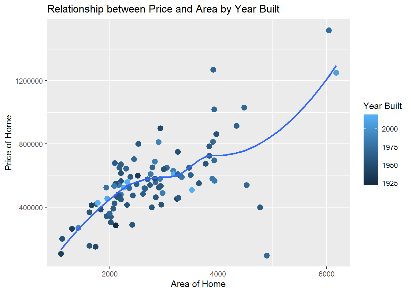
Claim 1: Yes, there seems to be evidence of a positive relationship between the price of the home and the area of the home. As area increases, so does price.
Claim 2: No, there does not seem to be any evidence to suggest that larger more expensive homes are newer than those houses that are cheaper and smaller. Points that are lighter colored (newer homes) are not concentrated on the top right of the plot.
Data 2: BRFSS
Use this dataset for Exercises 3 through 5.
The Behavioral Risk Factor Surveillance System (BRFSS) is the nation’s premier system of health-related telephone surveys that collect state data about U.S. residents regarding their health-related risk behaviors, chronic health conditions, and use of preventive services. Established in 1984 with 15 states, BRFSS now collects data in all 50 states as well as the District of Columbia and three U.S. territories. BRFSS completes more than 400,000 adult interviews each year, making it the largest continuously conducted health survey system in the world.
Source: cdc.gov/brfss
In the following exercises we will work with data from the 2020 BRFSS survey. The data originally come from here, though we will work with a random sample of responses and a small number of variables from the data provided. These have already been sampled for you and the dataset you’ll use can be found in the data folder of your repo. It’s called brfss.csv.
brfss <- read_csv("https://st511-01.github.io/data/brfss.csv")Exercise 3
- How many rows are in the
brfssdataset? What does each row represent? - How many columns are in the
brfssdataset? - Include the code and resulting output used to support your answer.
Write a sentence along with your code to answer your question
glimpse(brfss)Rows: 2,000
Columns: 4
$ state <chr> NA, "CO", "MN", "VA", "UT", "KS", "UT", "TX", "OR", "OH…
$ general_health <chr> "Fair", "Good", "Very good", "Excellent", "Very good", …
$ smoke_freq <chr> "Not at all", "Some days", "Every day", "Not at all", "…
$ sleep <dbl> 6, 7, 6, 8, 7, 10, 7, 6, 8, 8, 8, 6, 9, 8, 7, 7, 8, 6, …There are 2000 rows and 4 columns in the data set. Each row represents a respondent to the survey.
Exercise 4
Do people who smoke more tend to have worse health conditions?
- Use a segmented bar chart to visualize the relationship between smoking (
smoke_freq) and general health (general_health). Putsmoke_freqon the x-axis.- Below is sample code for releveling
general_health. Here we first convertgeneral_healthto a factor (how R stores categorical data) and then order the levels from Excellent to Poor. The same is done tosmoke_freq, with the ordering being from Not at all to Every day.
- Below is sample code for releveling
- You will add to the existing pipeline (code) to make the segmented bar chart.
brfss |>
  mutate(
    general_health = as.factor(general_health),
    general_health = fct_relevel(general_health, "Excellent", "Very good", "Good", "Fair", "Poor")
  ) # add a pipe here to start creating your bar chart
brfss |>
mutate(
general_health = as.factor(general_health),
general_health = fct_relevel(general_health, "Excellent", "Very good", "Good", "Fair", "Poor"),
smoke_freq = as.factor(smoke_freq),
smoke_freq = fct_relevel(smoke_freq, "Not at all", "Some days", "Every day")
) |>
ggplot(aes(x = smoke_freq,
fill = general_health)) +
geom_bar(position = "fill") +
labs(
x = "Smoking Frequency",
y = "Proportion",
title = "Relationship between Smoking and Health",
fill = "General Health"
)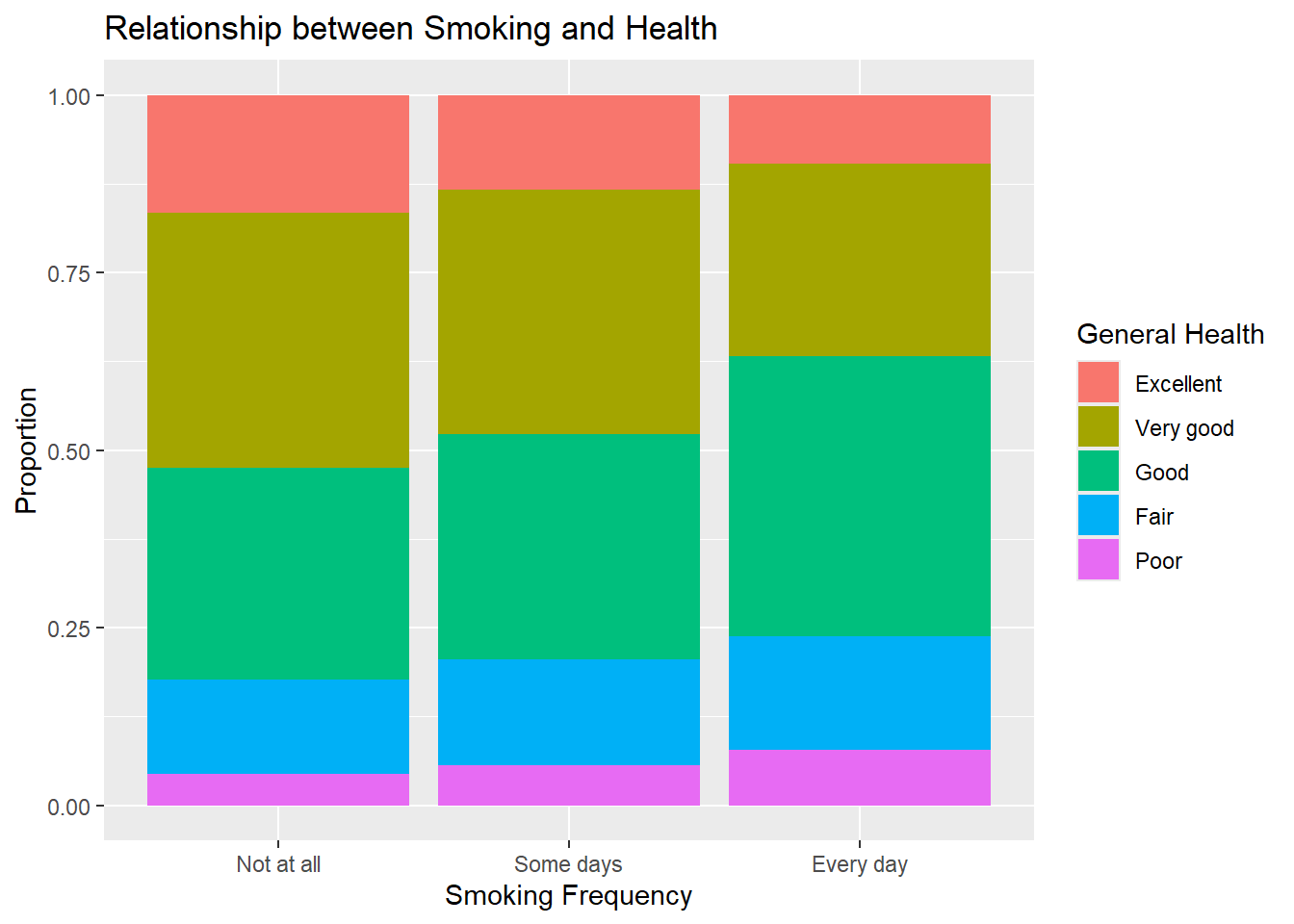
- Include informative title, axis, and legend labels.
- Comment on the motivating question based on evidence from the visualization: Do people who smoke more tend to have worse health conditions?
From the graph, you can see that as your smoking frequency increases, your general health tends to decrease. That is, we see less very good and excellent status, and more good, fair, and poor status and smoking frequency increases.
Exercise 5
How are sleep and general health associated?
- Create a visualization displaying the relationship between
sleepandgeneral_health. - Include informative title and axis labels.
- Modify your plot to use a different theme than the default.
- Comment on the motivating question based on evidence from the visualization: How are sleep and general health associated?
Now is a good time to save and render
# Answers will vary. Could be histogram or side-by-side boxplot

brfss |>
  mutate(
    general_health = as.factor(general_health),
    general_health = fct_relevel(general_health, "Poor", "Fair", "Good", "Very good",  "Excellent")
  ) |>
# Answers will vary. Could be histogram or side-by-side boxplot
brfss |>
mutate(
general_health = as.factor(general_health),
general_health = fct_relevel(general_health, "Poor", "Fair", "Good", "Very good", "Excellent")
) |>
ggplot(aes(x = general_health, y = sleep, fill = general_health)) +
geom_boxplot(alpha = 0.8, show.legend = FALSE) +
theme_minimal() +
labs(
x = "General Health",
y = "Sleep",
title = "Sleep and Health"
) 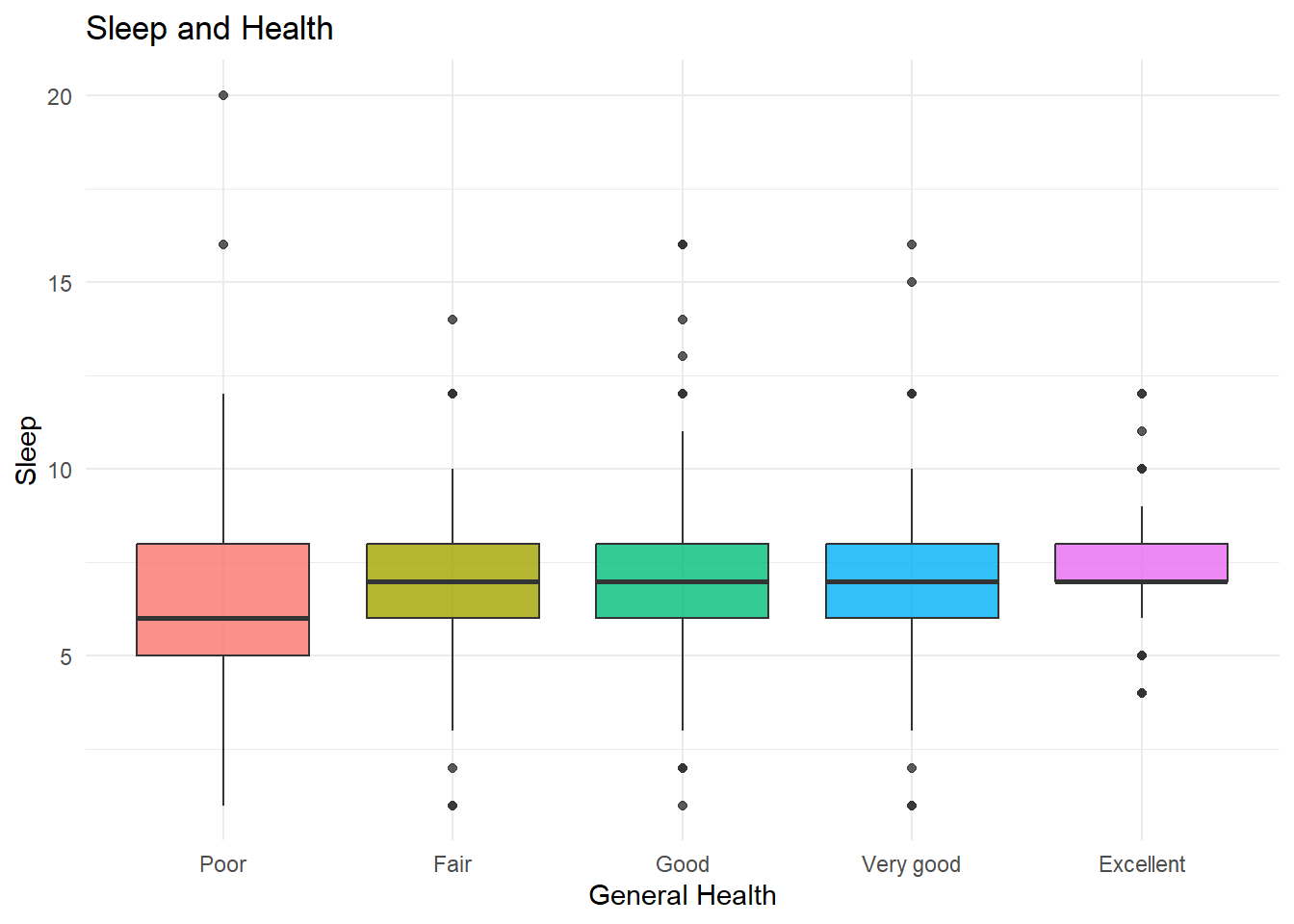
There is slight evidence to suggest that those who sleep less thend to have worse health. However, the variability around the medians (IQR) all tend to overlap, with fair through excellent having extremely similar medians.