intro to ggplot
Packages
Visualizing penguin weights
We are going to be using functions in the ggplot package to visualize data. This link will be helpful for us as we get more familiar with the verbiage: https://ggplot2.tidyverse.org/reference/
Analyzing a single variable is called univariate analysis
- Make a histogram of the penguin’s body mass by filling in the … with the appropriate arguments below.
penguins |>
  ggplot(
       aes(x = body_mass_g)) + #type variable name here
       geom_histogram(binwidth = 400) #type geom here
Warning: Removed 2 rows containing non-finite outside the scale range
(`stat_bin()`).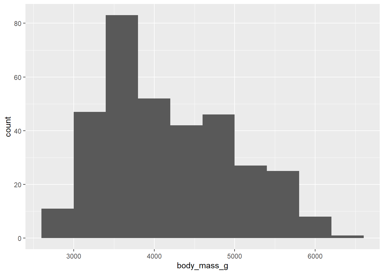
Note: There is no “correct binwidth. We want the histogram to be a shape where we can see its features (center, spread, ect).
Pull up the help file for the geom you used to make the histogram. Search for binwidth and read about it’s description. Next, play around with the binwidth argument inside the geom. Set an appropriate binwidth.
- Now, make a boxplot of the penguin’s body mass.
penguins |>
  ggplot(
    aes(x = body_mass_g)
  ) +
  geom_boxplot() +
  theme_dark()
Warning: Removed 2 rows containing non-finite outside the scale range
(`stat_boxplot()`).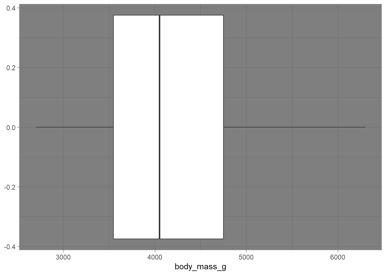
Let’s add a theme to your boxplot! Visit the following website, and layer on a theme (e.g. theme_bw()). https://ggplot2.tidyverse.org/reference/ggtheme.html
- Now, we are going to make a bar plot looking at the number of penguins looking at the count of penguins. The takeaway from this exercise is to help us understand the difference between
geom_col()andgeom_bar(). Let’s learn this together. I specifically want us to take note of the data structure.
How does species show up in the data set?
Every row has an individual observation of species
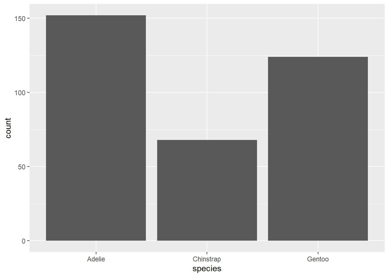
Change the above code to geom_col(). What happens?
When we change to geom_col(), we get an error message asking for a y aes.
What is the code doing below?
new_peng <- penguins |> #making a new R object called new_peng
  group_by(species) |> #grouping by species
  summarise(total = n()) #making a dataframe with the count of each species

new_peng |>
  ggplot(
    aes(x = species, y = total)
  ) +
  geom_col()
Takeaway: geom_col() does not calculate the count for us. The data need to be structured where we GIVE the count value as a variable. geom_bar() does the calculation for us, based on the x = var we give in the aes().
Two variables
Analyzing the relationship between two variables is called a bivariate analysis.
Note: aesthetic is a visual property of one of the objects in your plot. Aesthetic options are:
x y shape color size fill
-
Together: In order to choose the correct aesthetic option, think critically about how you want your variable to be mapped to your plot. Do you want a variable on the x axis? Use
x =. Do you want a variable to change the color of the geometric shape? Usecolor =orfill =! Let’s practice.
Make a histogram of penguins’ weight where the bars are colored in by species type.
penguins |>
  ggplot(
    aes(x = body_mass_g, color = species)
  ) +
  geom_histogram()
`stat_bin()` using `bins = 30`. Pick better value with `binwidth`.Warning: Removed 2 rows containing non-finite outside the scale range
(`stat_bin()`).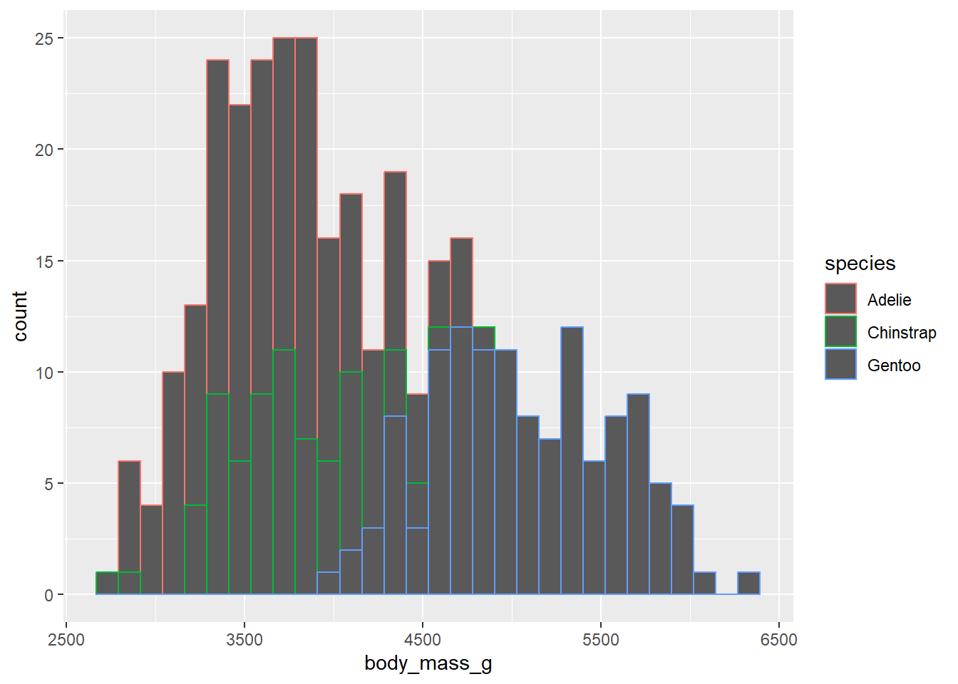
color = in the aes() function outlines the geometric shape in the plot.
penguins |>
  ggplot(
    aes(x = body_mass_g, fill = species)
  ) +
  geom_histogram()
`stat_bin()` using `bins = 30`. Pick better value with `binwidth`.Warning: Removed 2 rows containing non-finite outside the scale range
(`stat_bin()`).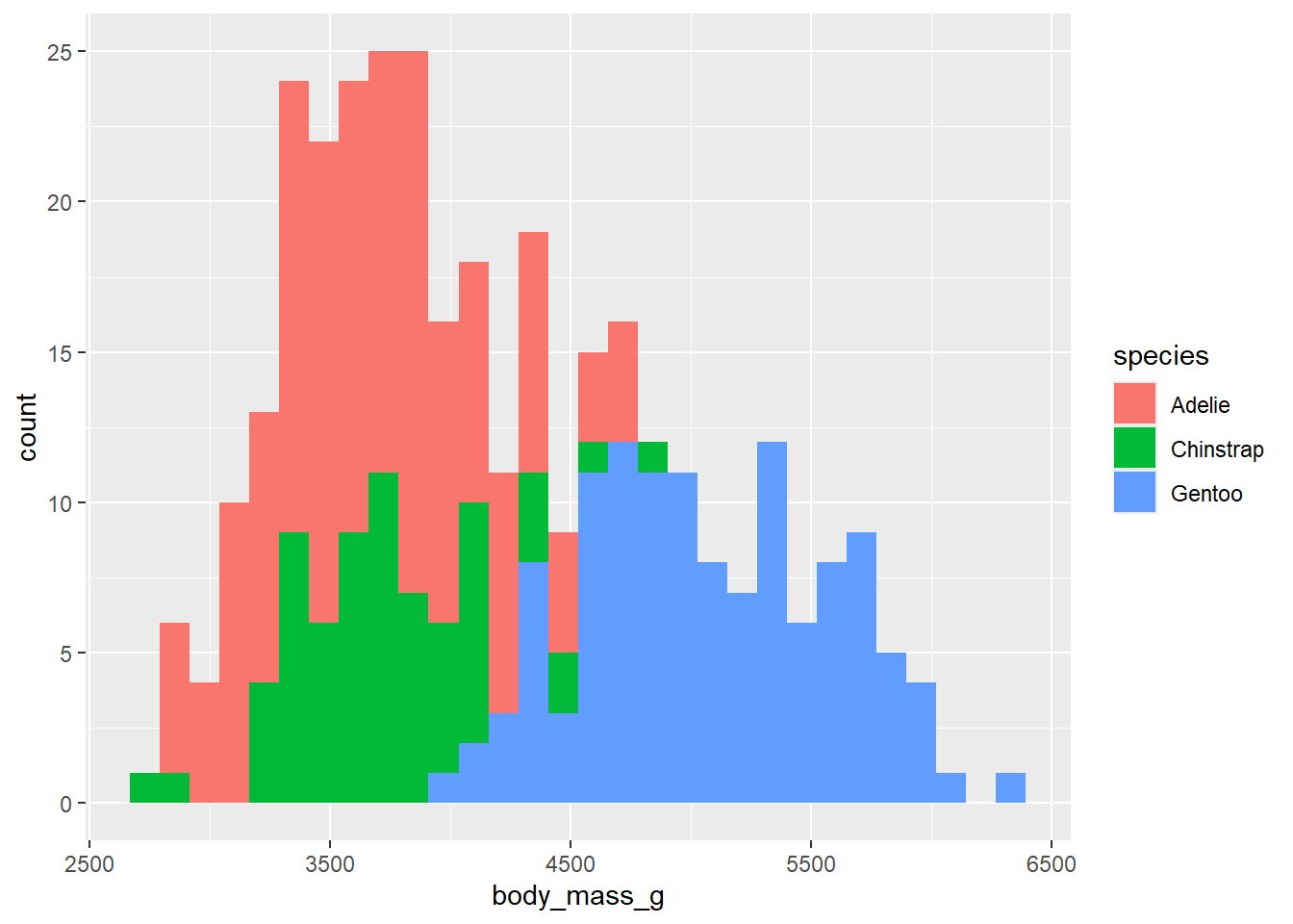
fill = in the aes() function fills in the geometric shape with color!
Note: the one exception is a scatterplot, because the points of the scatterplot are considered too small to count as a geometric shape. So the fill = will not work, and you will need to use color = to fill in the points.