Analyzing the relationship between two variables is called a bivariate analysis.
Note: aesthetic is a visual property of one of the objects in your plot. Aesthetic options are:
x y shape color size fill
Start here: Warm up
Together: In order to choose the correct aesthetic option, think critically about how you want your variable to be mapped to your plot. Do you want a variable on the x axis? Use x =. Do you want a variable to change the color of the geometric shape? Use color = or fill =! Let’s practice.
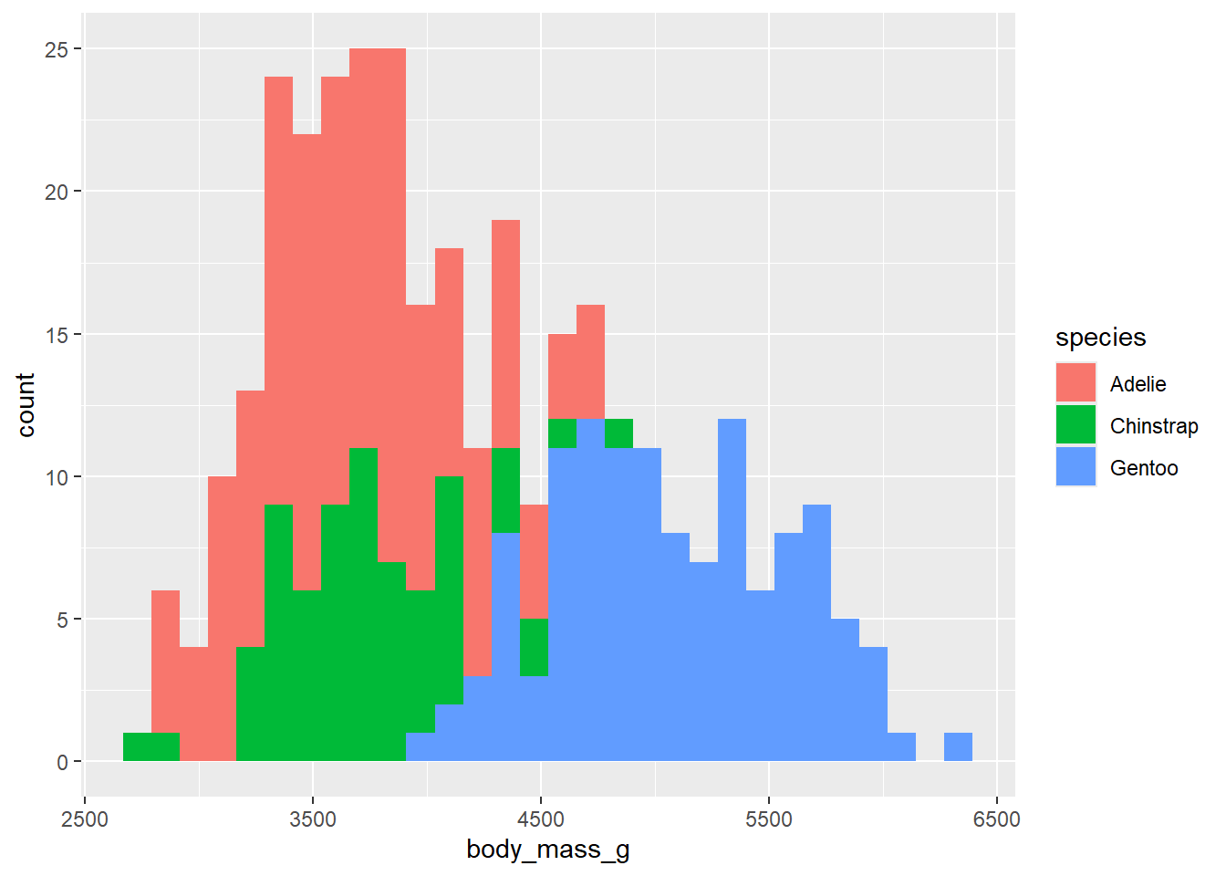
Make a histogram of penguins’ weight where the bars are colored in by species type.
`stat_bin()` using `bins = 30`. Pick better value with `binwidth`.
Warning: Removed 2 rows containing non-finite outside the scale range
(`stat_bin()`).
Takeaway: aes changes or plot based on variables in our data set. If we want to fill the bars conditioned on another variable, this goes in the aes() function. Note that the code will not run if we put fill = species in geom_histogram(). We can change features of the plot, not conditioned on data, by overriding arguments in geom_histogram(). For example, we can paint the bars blue by setting fill = "blue" in geom_histogram(). If we were to type fill = "blue" in the aes() function, it would create a fill variable for us with the categorical value of blue (which doesn’t make sense).
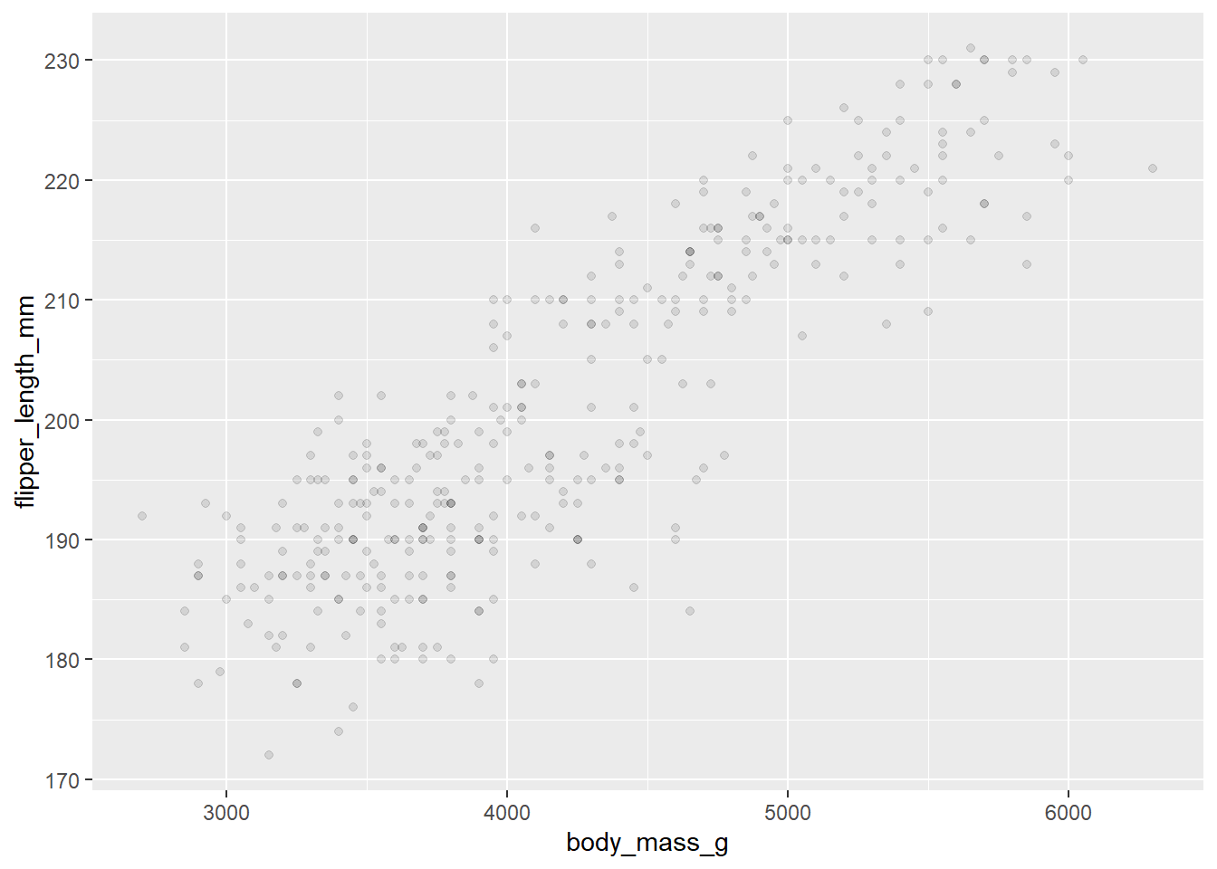
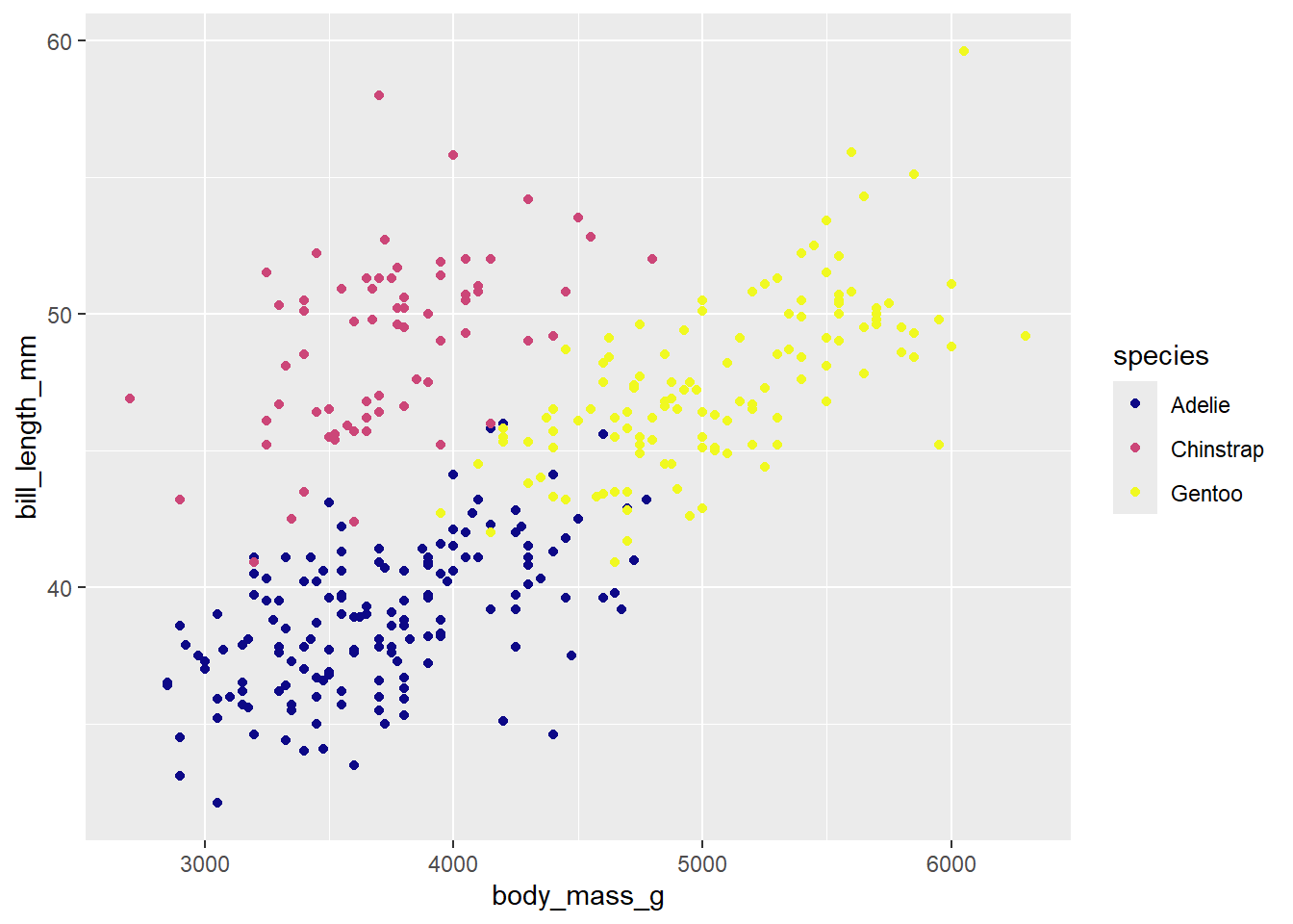
Now, let’s make a scatterplot! We are going to investigate if there is a relationship between body mass and flipper length! Let’s also introduce the idea of alpha!
penguins|>ggplot(aes(x =body_mass_g, y =flipper_length_mm))+geom_point(alpha =.1)
Warning: Removed 2 rows containing missing values or values outside the scale range
(`geom_point()`).
Takeaway: alpha is a very useful data visualization tool. This is especially true when you have overlapping data. The darker the area, the more dots are overlapped! This is something that can not be seen at alpha = 1.
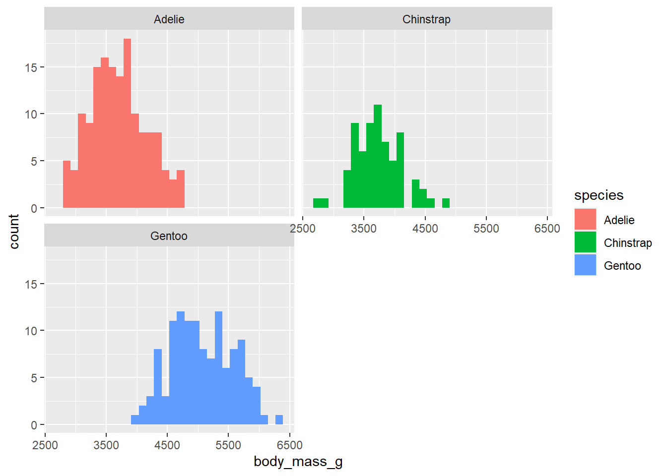
Let’s think back to question 4. It’s not ideal that all of the bars overlap. We can use facet_wrap to split the histograms apart! This function takes the name of the variable you want to split by, and how many cols/rows you want your plots to show up in. Note: the syntax for this function is ~variable.name. Run ?facet_wrap in your console to see the name of the row and column arguments within facet_wrap().
Take your code from question 4, copy here, and add code to “break apart” your histograms into three different bins.
`stat_bin()` using `bins = 30`. Pick better value with `binwidth`.
Warning: Removed 2 rows containing non-finite outside the scale range
(`stat_bin()`).
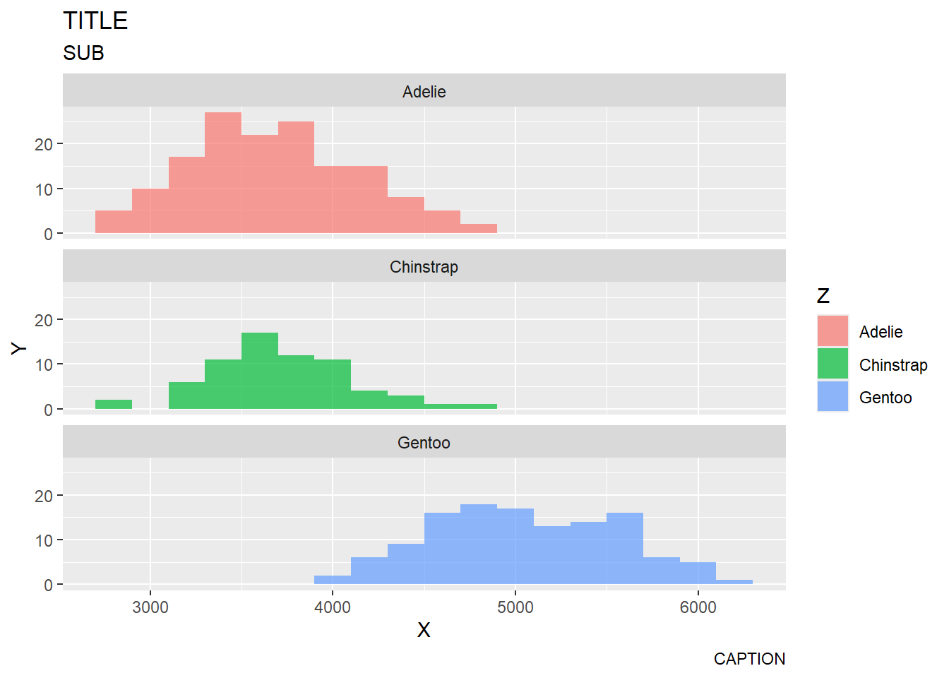
Let’s talk about labels! Labels go a long way in making an effective data visualization. To layer on labels, we are going to use the labs() function. Arguments within this function that we will use include:
Let’s add labels to the plot below. The code below should be the same code you wrote in question 6!
penguins|>ggplot(aes(x =body_mass_g, fill =species))+geom_histogram(binwidth =200, alpha =.7)+facet_wrap(~species, nrow =3)+labs(title ="TITLE", x ="X", y ="Y", subtitle ="SUB", caption ="CAPTION", fill ="Z")
Warning: Removed 2 rows containing non-finite outside the scale range
(`stat_bin()`).
Do we need a legend?
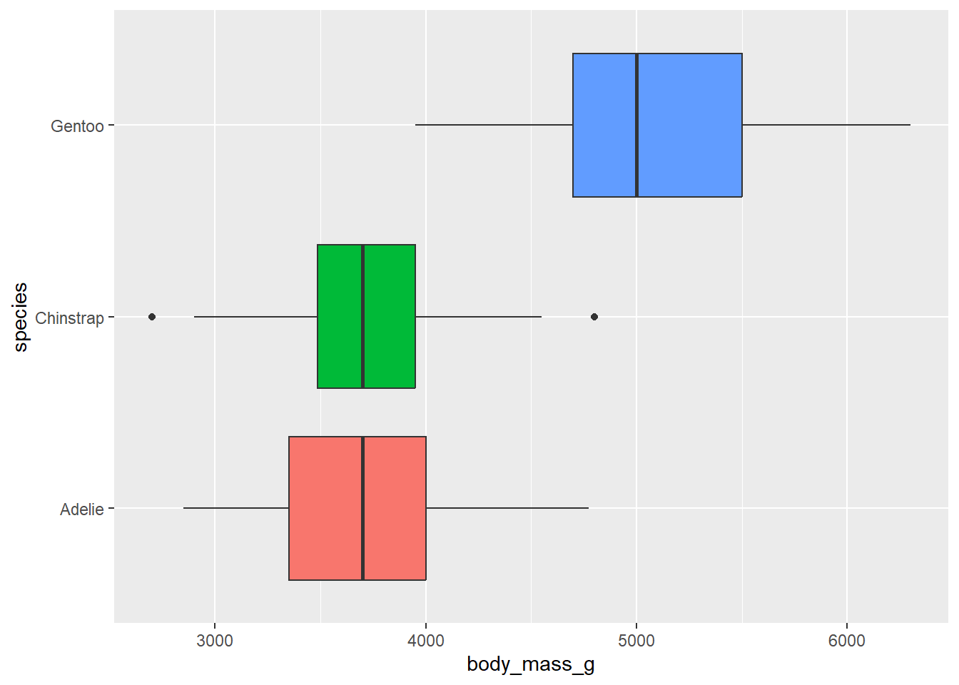
The code below creates side-by-side boxplots to compare body mass across species. Color the boxplots by species.
penguins|>ggplot(aes(x =body_mass_g, y =species, fill =species))+geom_boxplot()+theme(legend.position="none")
Warning: Removed 2 rows containing non-finite outside the scale range
(`stat_boxplot()`).
Do we need a legend? Why or why not?
No! This information is redundant
Let’s use the function theme to turn off the legend (for practice). Theme (different from adding a color theme) allows us to control a lot of the visual and text features of our plot. Please see the following reference here.
Add the following code to the above plot to turn off the legend: theme(legend.position = “none”). Note: You can also use “gone”!
Color pallets
We need to think critically about color when thinking about creating visualizations for a larger audience: https://ggplot2.tidyverse.org/reference/scale_viridis.html
Think about this is as our first introduction. We can create a colorblind friendly pallet using scale_colour_viridis_d() or scale_colour_viridis_c() depending on the type of variable we are working with.
Warning: Removed 2 rows containing missing values or values outside the scale range
(`geom_point()`).
Why _d vs _c ?
**_c when we work with a continuous variable! _d when our variable is discrete!**
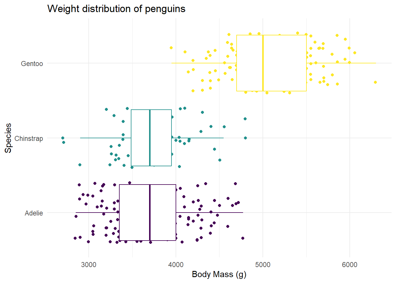
Recreate
Our task is to recreate the following image on our class slides. Hint: This plot uses theme_minimal() and scale_color_viridis_d(option = “D).
Hint: To make a scatterplot, we use geom_point. This is asking to space out or jitter the points over top the box plot. Our helpful link is a good reference for this: https://ggplot2.tidyverse.org/reference