  mean_mpg
1 20.09062Intro to Data Viz
Lecture 4
Dr. Elijah Meyer
NC State University
ST 511 - Fall 2025
2025-08-27
Checklist
– Are you keeping up with the prepare material?
– Did you clone today’s AE?
– Take advantage of TA office hours (and mine)!
– Quiz-1 released is out (due Friday 11:59pm)
– HW-1 released Thursday afternoon (on Moodle; due on Gradescope)
HW-1
There is a Workflow and Formatting section
– putting your name in the YAML at the top of the document
– Pipes %>%, |> and ggplot layers + should be followed by a new line
– You should be consistent with stylistic choices, e.g. %>% vs |>
We will add more rules once we explore the tidyverse stylings later in the semester!
HW-1
HW-1 will be due on Sunday Sep 7th at 11:59pm
Some topics on HW-1 we may not cover as in-depth until next week
Goals for today
– Finish summary statistics
– Understand the fundamentals of ggplot
– Build appropriate visualizations
– More practice with R
Warm up
Articulate this as a sentence
Warm up
What’s wrong?
Function vs argument
In the following code…
What’s a function? What’s an argument? How can you tell?
Monday’s AE
I want to demonstrate how to pull up a new project + how to check you are in your correct project
Warm Up

– What are the variables?
– What patterns / trend can you takeaway from this graph?
What types of plots can we make?
Golden Rule We let the type of variable(s) dictate the appropriate plot
– Quantitative
– Categorical
When we go through how to make graphs in R, we are going to be mindful on the type of variable(s) we are using.
How do we make graphs?
The process
mtcars
You want to create a visualization. The first thing we need to do is set up the canvas…
The process
mtcars |>ggplot()
The process
mtcars |>ggplot(aes(x = variable.name, y = variable.name))aes: describe how variables in the data are mapped to your canvas
The process
+ “and”
When working with ggplot functions, we will add to our canvus using +
The process
mtcars |>ggplot(aes(x = variable.name, y = variable.name)) +geom_point()The process

Scatter plot
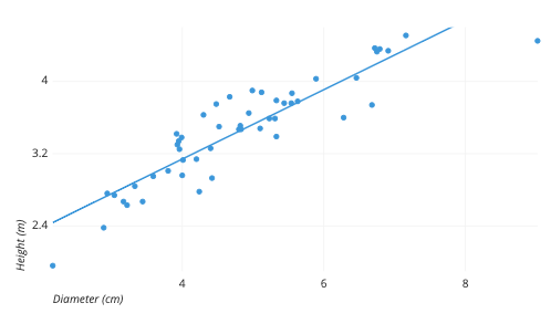
Scatter plot
– Two quantitative variables
Histogram
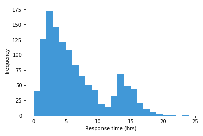
Histogram
– One quantitative variable
Bar plot
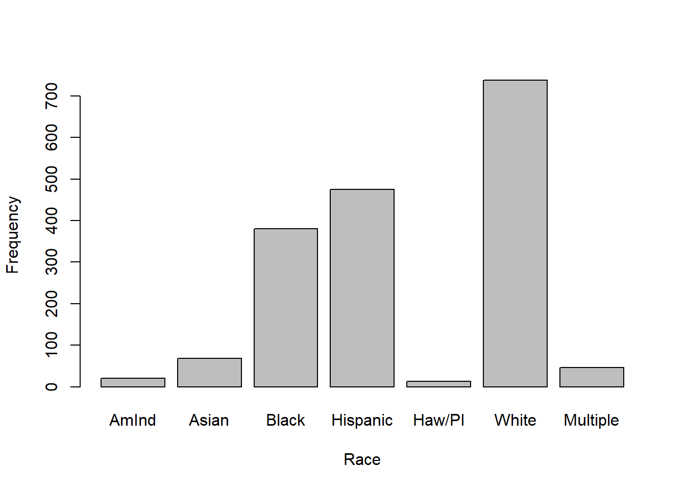
Bar plot
– One categorical variable
Segmented bar plot
Segmented bar plot
– Two categorical variables
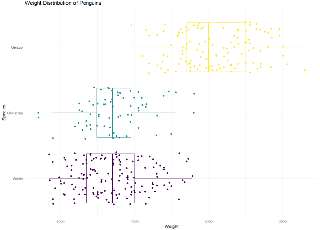
Boxplot
Boxplot
– One quantitative; One categorical
ggplot AE
In summary
– summarise is used to calculate statistics
– na.rm is a common argument used to override NA values during calculations
– ggplot() sets up our canvas
– aes maps variables from our data set to the canvas
– geom tells R what type of picture we want to paint
Recreate: For next time